Analysing the Oasys Report |
|
The Oasys report has 5 sections, the daily graph, graphs
by time of day, graphs by time from waking, shift trend graphs and the
conclusions. Please see The Oasys Report section from the Oasys help pages for more detailed information.
Daily Graph
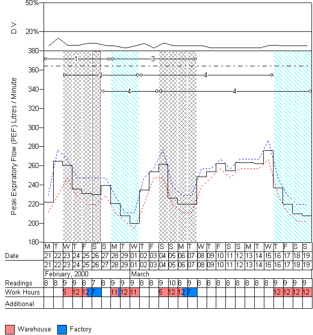
The daily graph shows the maximum, mean and minimum reading for each day. The
readings can be linearised if using non linear Mini-Wright meters. The data can
be interpreted into "pseudo" days (reccommended) to improve tha analysis. More
information on interpretation is given in the Oasys program description section.
The plot shows:
- Diurnal variation (in the top panel)
- Predicted value (horizontal dashed line)
- Daily maximum reading (blue line)
- Daily mean reading (black line)
- Daily minimum reading (red line)
- Working shift (Background, white - rest day, blue diagonals - day shift etc)
- Excluded days, the data is shown in the graph so the user can check the
validity of excluding the days, it is not used in the analysis (Grey Backround)
- Oasys complex score (Number in a horizontal line, circular markers)
- Start and End Date of "Pseudo" day (Legend)
- Number of readings (Legend)
- Number of hours worked, colour coded by job / location (Legend)
- Indicators to show if there is a waking reading, if a waking reading has
been created (part of interpreting "pseudo" days), if there is a comment and if
the day has been excluded.
The current selection (shown as a dotted rectangle on the graph) can be used
to choose a section of days to comment on and optionally exclude. The panel on
the right shows data calculated using only the selected range and the panel on
the bottom shows any comments within the range.
Holding the mouse over a day will display summary information including
waking reading, waking time, working shift, comments, exclusions and
interpretation details.
This record clearly shows deterioration during the working week with
substantial improvement on holidays and at weekends. There are two good days at work, which could hold a
clue to the cause of disease.
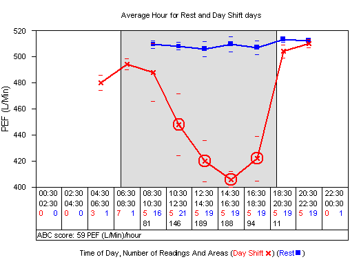
Time of Day
The "Time of Day" graphs show the average day away from work and the average
day at work (separated for each shift and for each job / location). Readings are
meaned over each 2 hour period. The plot shows the days away from work (blue
line) showing a stable peak flow and an average
day shift shift (red line) showing an afternoon trough with following improvement. The error bars show 1 standard error of the mean at each point.
The shaded areas show the minimum, mode and maximum times of starting and
stopping work. The dark grey areas show the minimum and maximum times. The black
lines show the mode times. In this example the patient always starts and ends work at the
same time (7am and 7pm respectively).
The legend shows the time periods used to average the readings, the number of
rest / work readings in each period and the area imbetween the two graphs for
each period and as a total.
These graphs are repeated for each type of shift that the patient works and
for each job / work location.
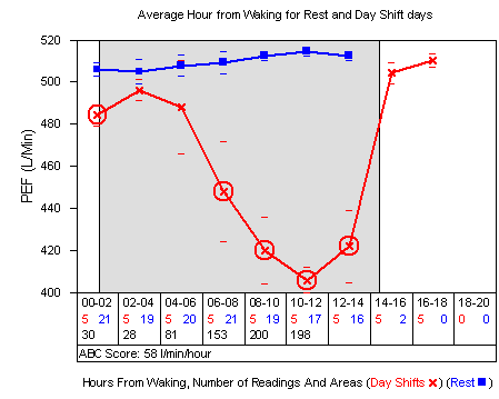
Time from waking
The "Time From Waking" graphs are a similar format to the "Time Of Day"
graphs. The readings are meaned for each 2 hour period after waking up. This can
remove bias for patients that usually wake up later at weekends. The graphs are repeated for shift and job / work
location.
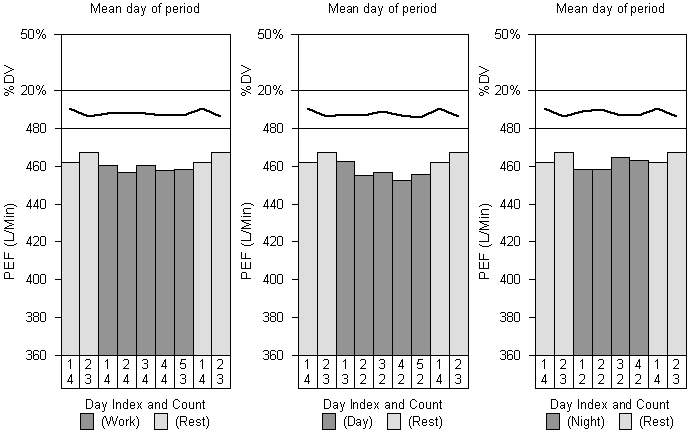
Shift Trends
The "Shift Trends" graph shows the mean daily peak flow for the first and second
days away from work (light grey background) the first 5 days at work
(dark grey background) with a repeat of the first three days away from work at
the end of the graph. More or less days at and away from work are shown
depending on the available data. These graphs are repeated for each type of
shift.
There is an equivalent daily deterioration in this record.
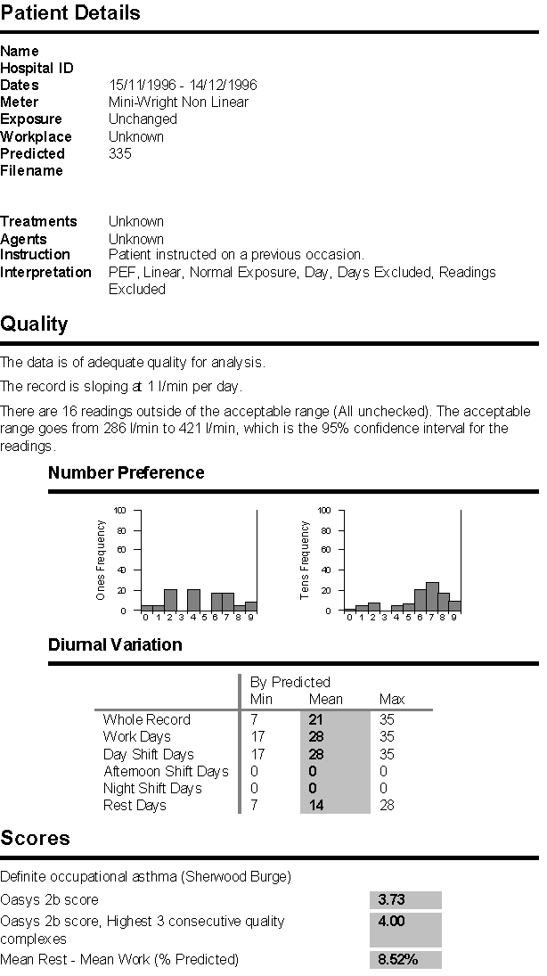
Conclusions
The "Conclusions" section of the Oasys report shows demographics, quality and
Oasys scores. The demographics include the type of meter used, the workplace,
the predicted value, a list of the treatments, a list of suspected causative
agents and how the patient was instructed.
Oasys has research based quality criteria and a statement is shown stating
whether these criteria have been met, along with reason for failure if
applicable. The software plots a regression line through the daily means and
reports the slope of this line. There is no evidence as yet to show what level
of slope is acceptable / unacceptable. A statement detailing the readings
outside the acceptable range is shown, along with what the acceptable range is.
This defaults to the 95% confidence interval but can be set manually. Number
preference graphs are shown for the 1's and 10's digits and Oasys shows a
warning if it suspects fabrication (evidenced from the 1's digit when using
logging meters) or if it thinks the patient has been rounding to the nearest 25
or 50. A table showing the aggregate diurnal variations separated by shift is
displayed.
The scores section shows any opinions entered by users, the Oasys-2 score and
the Wasif score (mean work reading - the mean rest reading). The Oasys-2 score
is shown for the entire record and for the most positive part of a record that
meets quality criteria. This can help to pick out intermittent effects in long
records. The Wasif score is still being validated.
Comments
Please sign in or register to add your thoughts.