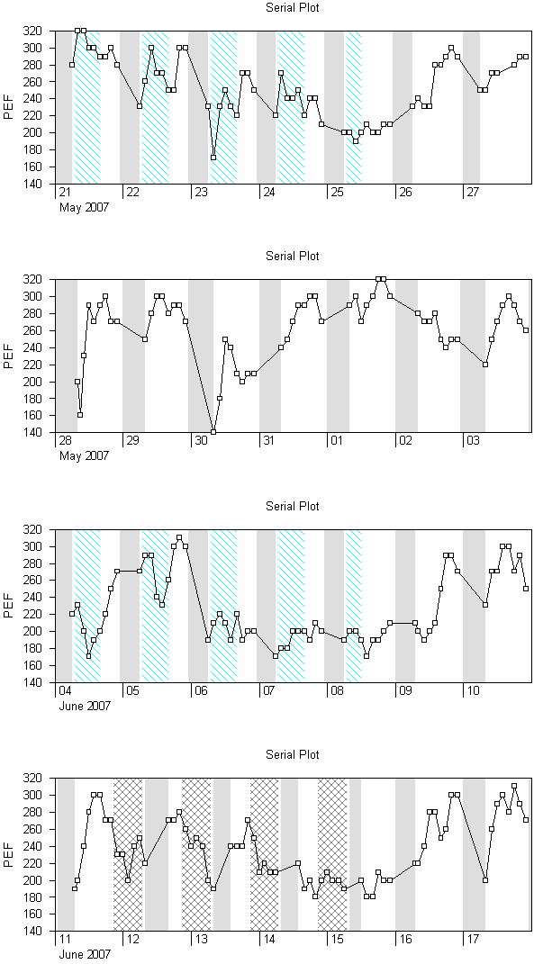
Oasys doesn't recommend use of the serial plot in making a diagnosis of occupational asthma. This is why it is on a different window and not part of the main
Oasys Report. However some people seem to like it so we have included it in the Oasys program. Click on "View - Serial Plot", a new window will be opened showing the serial plot (example below).
The line on the graph shows the date and time of each reading (on the x axis) against Peak Flow (on the y axis). Areas shaded grey are when
the patient is asleep. Areas with a white background are when the
patient is awake but not at work. Areas with a patterned background are
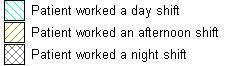
when a patient is at work, the pattern and colour identify the type of
shift the patient is working, using the legend below.
The graph can be copied onto the clipboard for pasting into other programs. Click anywhere on the graph and then click on "Edit - Copy". A message will appear telling you the dimensions of the graph. Simply open another program and paste in the picture. The picture is copied as a metafile, or .emf (as opposed to a .jpg, .gif etc) and some programs like to be told the original size of the image, which is why you are shown the message.
The graph is very long so Oasys provides some options to control the display (see
Oasys Options for more details). The graph below shows 7 days per graph, 2cm per day (the x axis) and 1cm for every 20 L/min division of PEF (the y axis). The x and y axis might not be 1cm and 2cm on your screen (which may have more or less pixels than the one that the image below was created on). The options can also dictate how big the graph is when printed.
Example graph
Comments
Please sign in or register to add your thoughts.