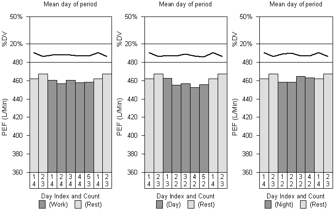
Click on the "Shift Trends" tab of the Oasys Report to access mean peak flow by day of period graphs.
The x axis of the graphs is slightly complicated. The first bar shows the mean of all peak flow readings taken on the first day away from work (generally on Saturdays if a patient is working a standard Monday to Friday pattern). This is shown in light grey. Any more light grey bars show the mean of all peak flow readings taken on the second, third, fourth etc days away from work (So a patient working Monday to Friday would start the graph with two grey bars corresponding to all readings taken on Saturdays and all readings taken on Sundays). The dark grey bars show the same thing for the first day at work (normally Mondays), the second day at work (normally Tuesdays) and so on. The light grey bars are then repeated at the end of the graph to make the graph look nicer. The first line of numbers on the x axis is the "Day Index" and corresponds to whether it is showing data for all first days, all second days and so on. The second line of numbers show how many such days that there are.
The y axis for the bar chart is mean peak flow. There is also a diurnal variation graph stacked on top of the bar chart. The x axis is the same for this. The y axis shows the diurnal variation. A line is drawn at 20% which a lot of people think is significant. We
don't attach a lot of / any importance to diurnal variation when
diagnosing occupational asthma. If the line is solid then the diurnal
variation is calculated as (Maximum PEF for day - Minimum PEF for day) /
Predicted Peak flow. If there is no predicted peak flow available then
the line is dashed and the diurnal variation is calculated as (Maximum
PEF for day - Minimum PEF for day) / Mean peak flow for entire record.
Separate graphs are shown for each shift type if applicable
Comments
Please sign in or register to add your thoughts.