The 2 Hourly "Time Of Day" Graphs |
|
Click on the "Time Of Day" tab of the Oasys Report to access mean 2 hourly graphs of peak flow by time of day.
The graphs show mean 2 hourly peak flow on the y axis. The x axis shows the 2 hourly time range for each point (using the 24 hour clock), the number of work and rest readings at each point, the area between the work and rest lines at each point and below this is the ABC score (which is the total of the area between the work and rest lines divided by the number of hours that the lines overlap). The minimum criteria for a valid ABC score is recording every 2 hours with at least 7 work days and 3 rest days. The workdays do not have to be consecutive. It is therefore suitable for shorter records than the Oasys score but requires more frequent readings. The ABC score is shown on every graph, but is only validated for Day Shifts, so is presented as information only. The
Conclusions page of the report shows the validated ABC score. The blue line with square markers shows the mean rest peak flow for each two hourly point. The (usually red but sometimes other colours) line with cross markers shows the mean work peak flow for each 2 hourly point. The horizontal lines above and below a point show the 95% standard error of the mean about that point and are drawn in the same colour as the line and markers. Work points which are surrounded by a circle are positive on the timepoint score (this is a statistical method looking for a 95% significant difference between the rest and work points). Timepoint analysis requires the same minimum data quantity as the ABC score but in addition requires the measurements to be at the same time (within one hour) on work and rest days. Waking should be at roughly the same time on work and rest days. These are only shown for day shifts when there is enough data to make the analysis. The
Conclusions page of the report shows the validated Timepoint score.
There can be many graphs shown on this page of the report and they show slightly different things, so they are described in more detail below.
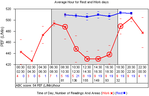
Average Hour for Rest and Work Days
This graph shows data for all rest readings and all work readings, irrespective of shift and specific work exposure. The grey background portion of the graph shows the mode time of starting work through to the mode time of ending work.
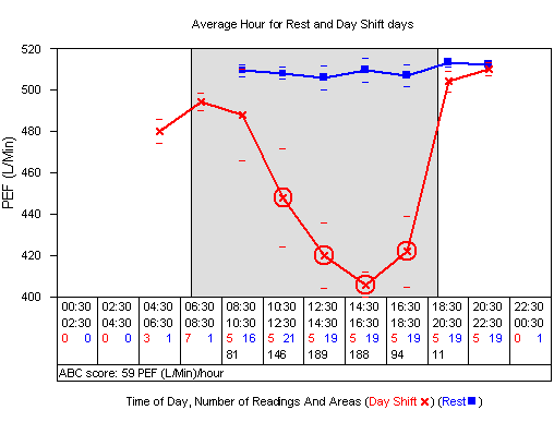
Average Hour for Rest and Day (or Afternoon) Shift Days
This graph shows data for all rest readings and Day Shift (or Afternoon Shift) readings only. The two vertical black lines at the edge of the grey area indicate the mode times of starting and ending work. Any darker grey areas (none on this graph) show the earliest and latest time of starting and ending work. The fact that there are no darker grey areas tells us that the patient starts and ends work at the same time every day during the record (when working a day shift). The night shift graph later demonstrates a variable end of work time.
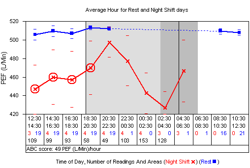
Average Hour for Rest and Night Shift Days
This graph shows data for all rest readings and Night Shift readings only. The shaded areas show the earliest, mode and latest times of starting and ending work in the same way as the Day and Afternoon shift graphs. This graph shows that the earliest end work time is 3am, the mode 5am and the latest is 7am.
To make the night shift graph easier to view the x axis starts at midday, runs to midnight and then back to midday. This way the work period is in the middle of the graph in the same way as all the other graphs (which start at midnight, run to midday and then back to midnight).
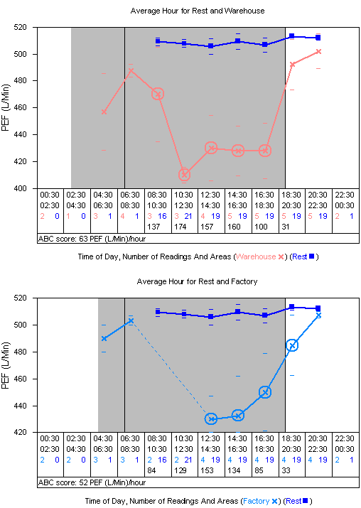
Average Hour for Rest and Work Exposures
If you have entered multiple work exposures in the record (defined in the
patient demographics and entered from the
data sheet) then Oasys will draw a graph for each work exposure that has enough data to make it worthwhile. This graph shows data for all rest readings and a particular work exposure only.
On the graphs below there is no light grey shaded area. This tells us that the latest time of starting work and the earliest time of ending work overlap. The black vertical lines still give the mode time of starting and ending work. In the first graph below we can see that the earliest time of starting work is 3am and the latest time of ending work is 7pm (the same as the mode).
Comments
Please sign in or register to add your thoughts.