Full Oasys Report
The Oasys Report is broken down into sections, which are explained below.
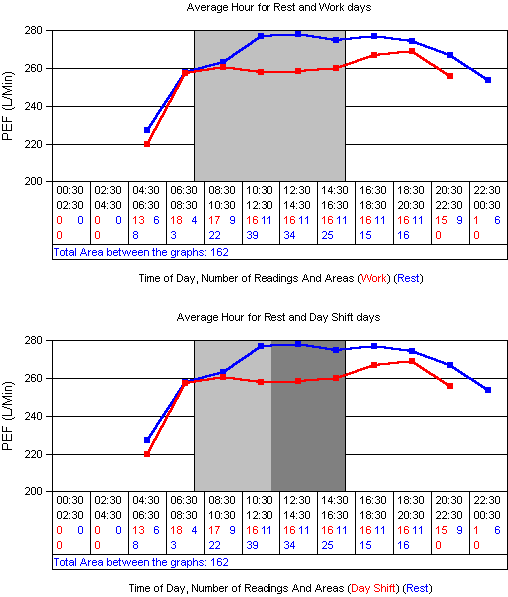
Average Hour
These graphs show the average of all PEF readings for a particular time of day. These are separated by working shift. Also shown is the number of readings used to make that average and the area difference between the work and rest portions of the graphs. The light shaded area shows the mode times of starting and finishing work. On all apart from the first graph dark grey areas are used to show the minimun and maximum times of starting and finishing work.
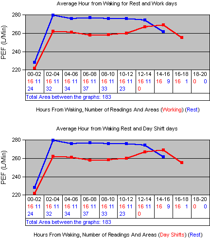
Average Hour From Waking
These graphs show the average of all PEF readings for a number of hours since waking up. These are separated by working shift. Also shown is the number of readings used to make that average and the area difference between the work and rest portions of the graphs.
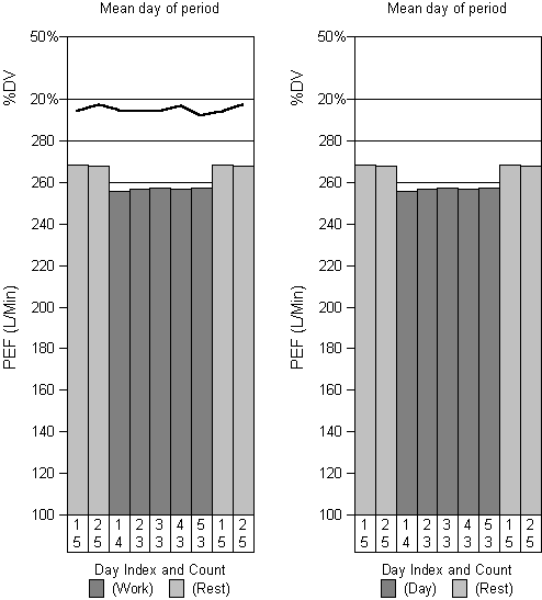
Shift Trends
These graphs show the average of all PEF readings for a the Nth day of a period. For example the first bar on each graph shows the average PEF for all first days off work. The second bar on each graph shows the average PEF for all second days off work. Also shown is the average diurnal variation and the number of days used in making the averages.
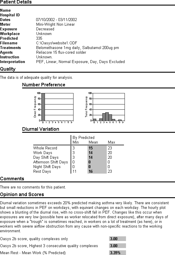
Conclusions
The conclusions show some demographics, the treatments, exposure and causative agent, a quality statement, number preference (for identifying fabricated readings and rounding), aggregate diurnal varitions, comments, opinion and scores.
Back to Serial Peak Flows